Redefining affordable vision care
Brand Strategy + Visual Identity Design System
Overview
Optical Club is a Saudi eyewear brand on a mission to make quality vision care affordable, stylish, and accessible. With over 13 retail stores and a growing digital presence, the brand needed an identity that communicated value without losing style.
Optical Club is a Saudi eyewear brand on a mission to make quality vision care affordable, stylish, and accessible. With over 13 retail stores and a growing digital presence, the brand needed an identity that communicated value without losing style.
Challenge
The Saudi optical market is crowded with functional, low-price players but lacks lifestyle-driven eyewear brands.
The Saudi optical market is crowded with functional, low-price players but lacks lifestyle-driven eyewear brands.
Approach
Optical Club needed to:
→ Differentiate in a cluttered market
→ Appeal to family bulk-buyers and style-conscious young adults
→ Build trust while signaling affordability
Optical Club needed to:
→ Differentiate in a cluttered market
→ Appeal to family bulk-buyers and style-conscious young adults
→ Build trust while signaling affordability
Strategic Positioning
The identity positioned Optical Club as a fresh, lifestyle-forward brand in the Saudi eyewear market. Its adaptive system created consistency across touchpoints while staying true to its promise: vision meets value.
The identity positioned Optical Club as a fresh, lifestyle-forward brand in the Saudi eyewear market. Its adaptive system created consistency across touchpoints while staying true to its promise: vision meets value.
Rollout
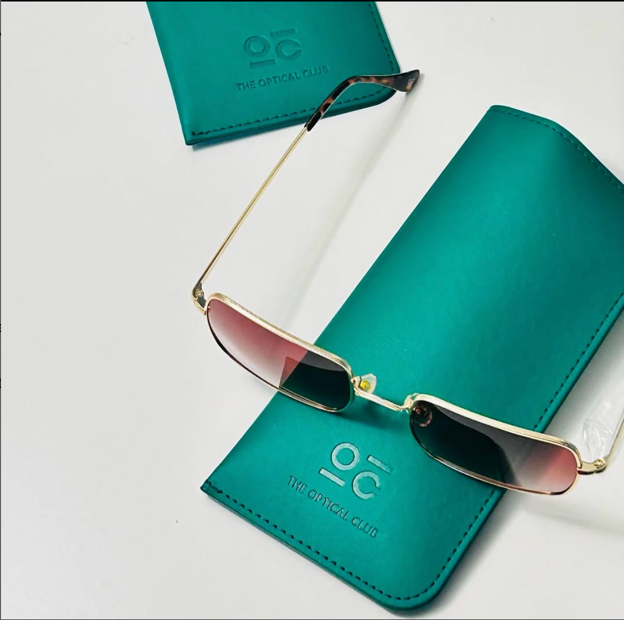
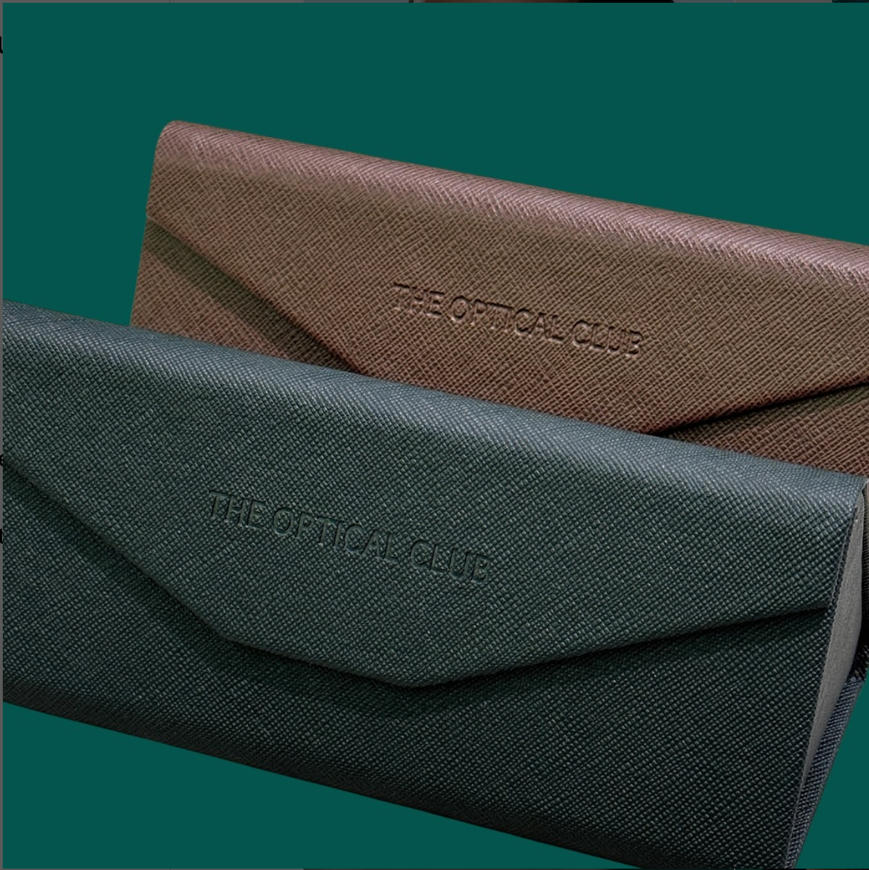
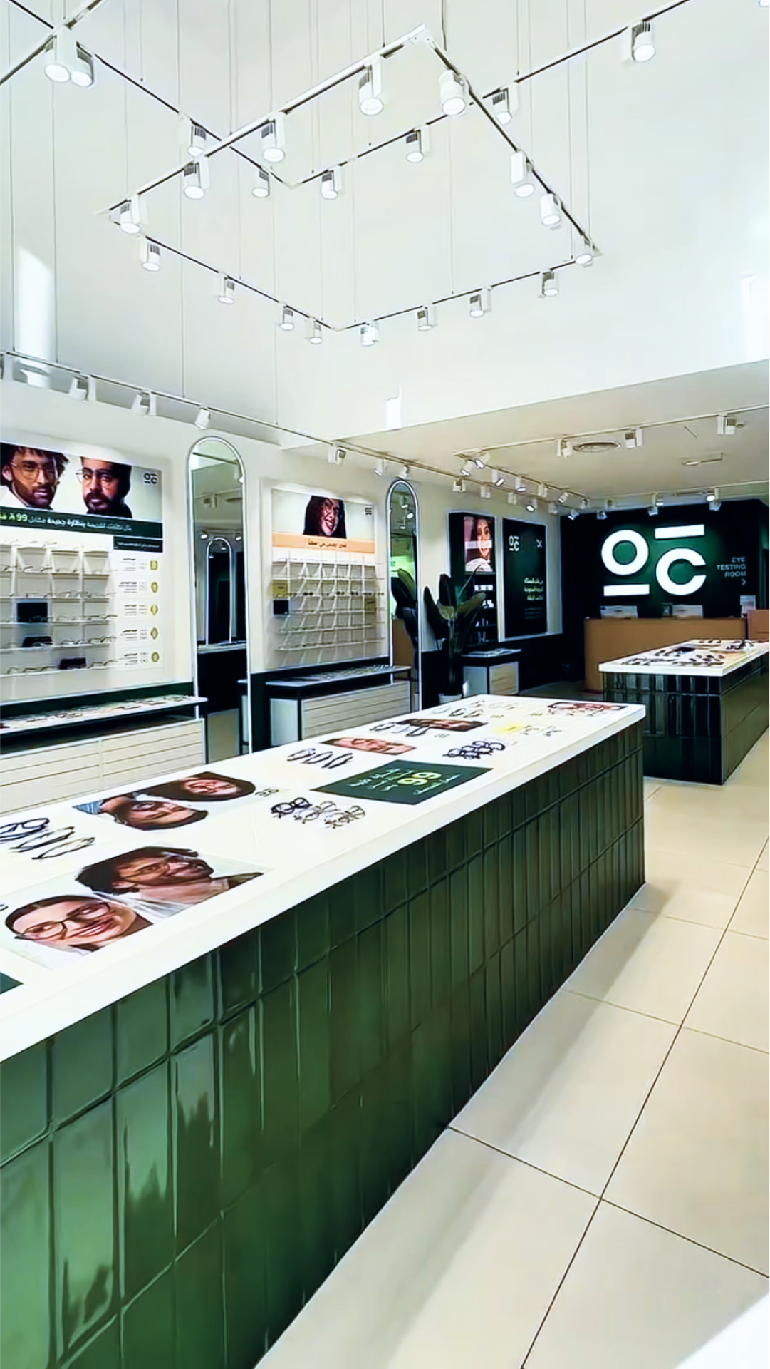
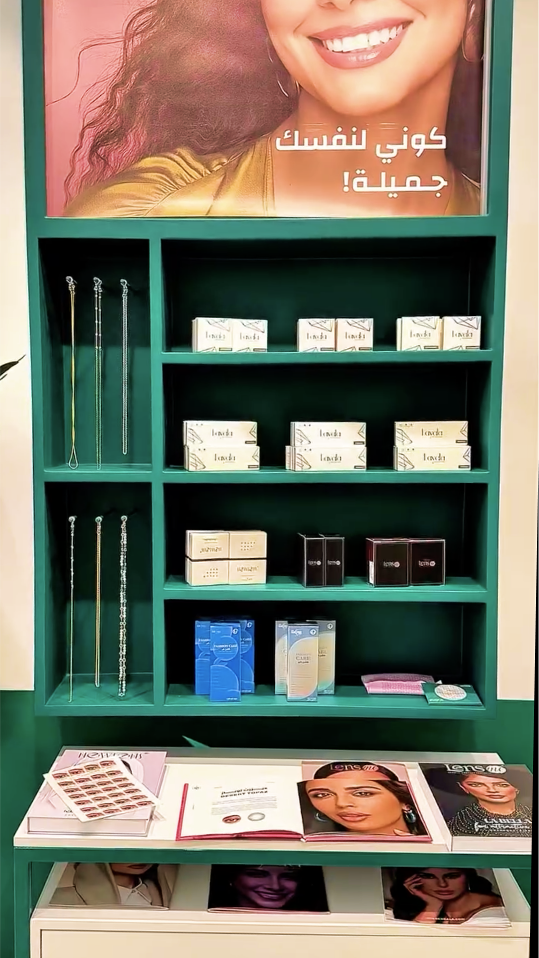
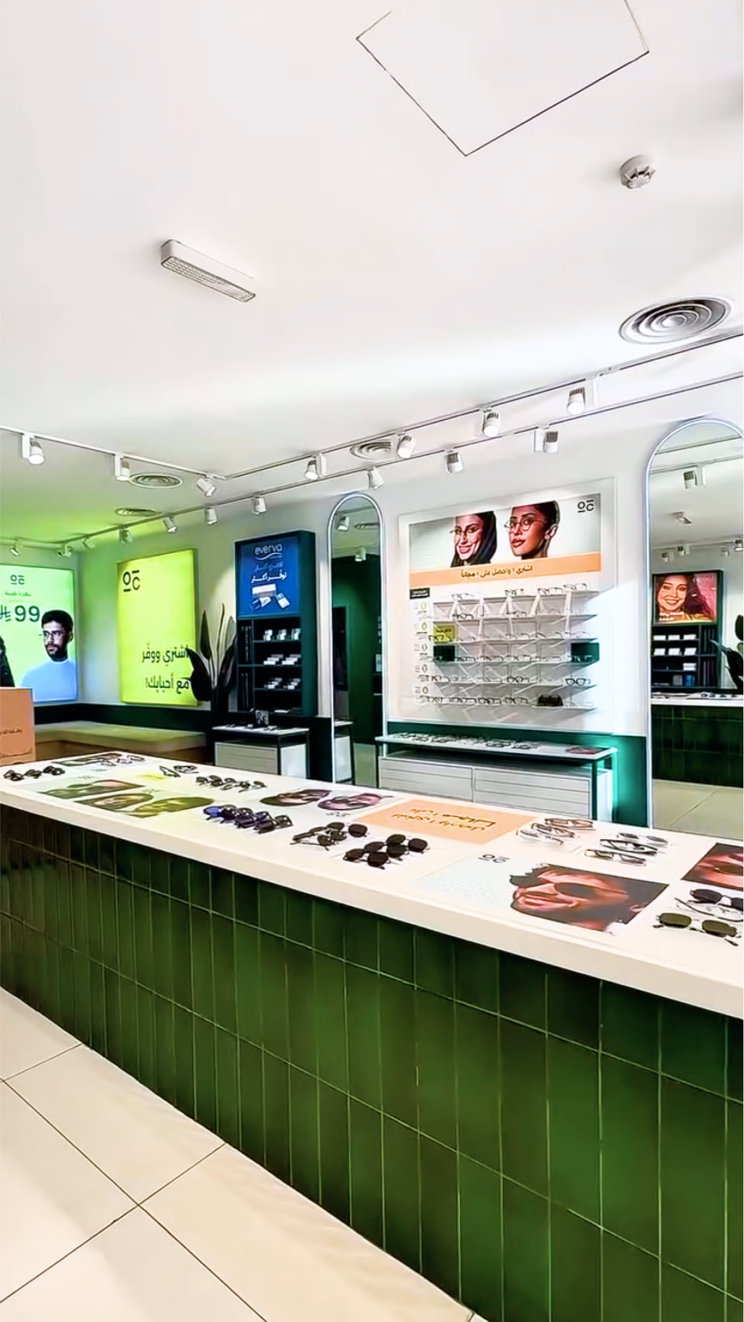
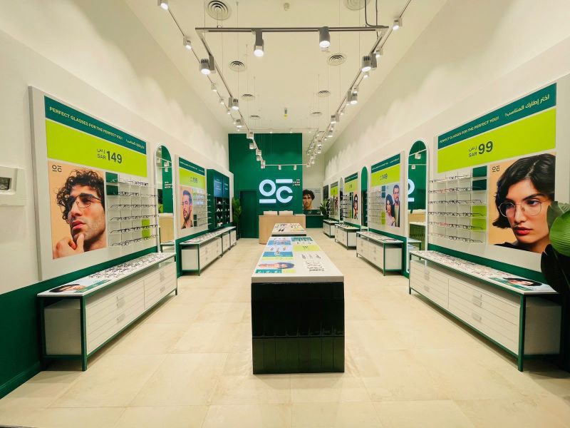
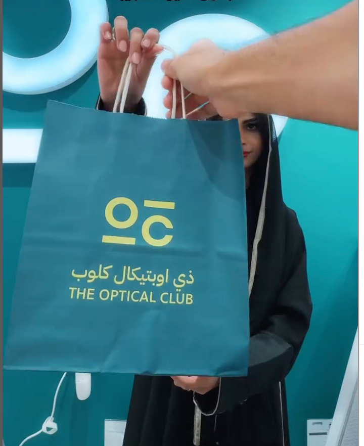
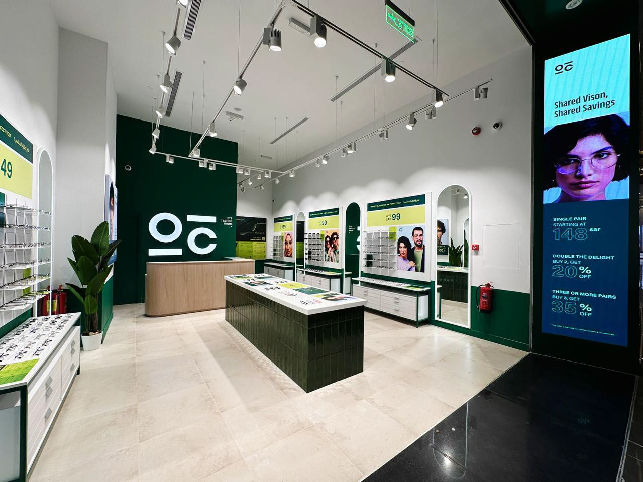
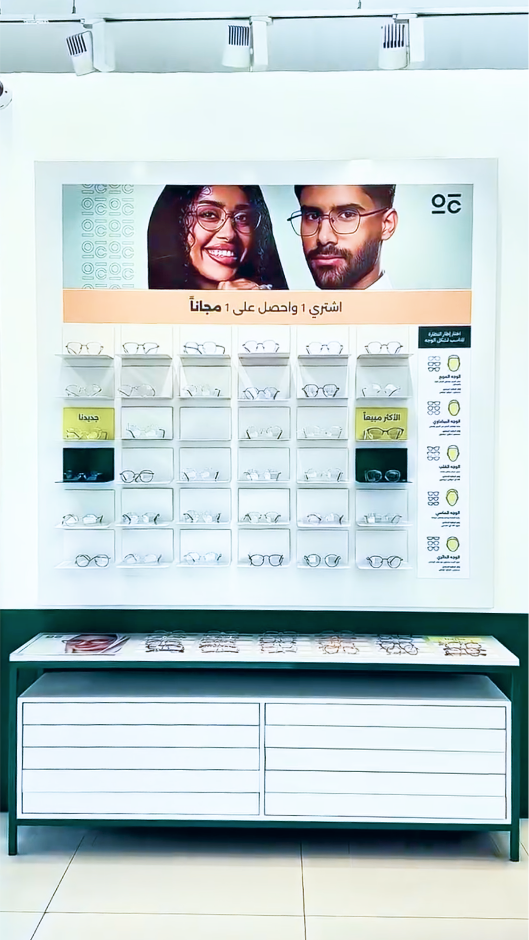
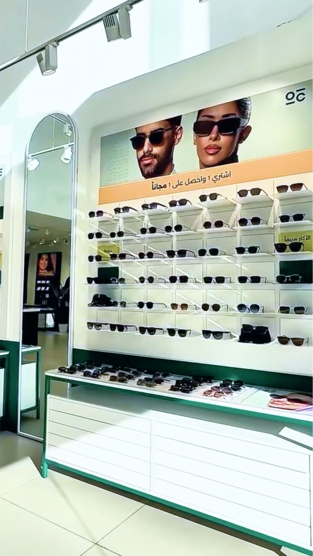
The new identity was rolled out across 13+ stores, packaging, website, and app, reinforcing Optical Club as a trusted, lifestyle-driven brand.
The new identity was rolled out across 13+ stores, packaging, website, and app, reinforcing Optical Club as a trusted, lifestyle-driven brand.
Impact
→ Created distinction in a crowded category
→ Elevated the brand perception from functional to aspirational
→ Built stronger recognition, customer trust in retail & digital spaces
→ Created distinction in a crowded category
→ Elevated the brand perception from functional to aspirational
→ Built stronger recognition, customer trust in retail & digital spaces
Role: Creative Director – Brand Identity & Retail Experience Design
Scope: Brand Strategy · Visual Identity System · Brand Guidelines · Brand Experience
Balancing value with lifestyle in Saudi eyewear
Approach & Craft
We set out to redefine affordable vision care with a minimalist, fun, and socially driven identity. The goal was to balance affordability with style and modernity, creating a brand system flexible enough to work across retail, packaging, and digital platforms.
We set out to redefine affordable vision care with a minimalist, fun, and socially driven identity. The goal was to balance affordability with style and modernity, creating a brand system flexible enough to work across retail, packaging, and digital platforms.
We crafted a bold identity that balances accessibility with style and resonates with a diverse, family-oriented market. Neutral base with vibrant accents for energy and freshness. Maintaining a strong balance between being people-first, inclusive, confident yet approachable.
Guiding Pillars
Accessibility → Clear typography and recognizable design
Community → Friendly, vibrant colors and inclusive tone
Simplicity → Clean logo system and modular brand language
Innovation → Adaptive visual identity across retail, packaging, and digital
Accessibility → Clear typography and recognizable design
Community → Friendly, vibrant colors and inclusive tone
Simplicity → Clean logo system and modular brand language
Innovation → Adaptive visual identity across retail, packaging, and digital
A bold Identity | Clarity meets Confidence
Logo System
Monogram (OC):
The Optical Club monogram reduces the brand to its essentials: two geometric circles forming an “O” and “C” that also resemble a pair of eyeglass frames. The connecting dash doubles as a bridge, creating a direct link to eyewear while keeping the mark minimal and iconic.
The Optical Club monogram reduces the brand to its essentials: two geometric circles forming an “O” and “C” that also resemble a pair of eyeglass frames. The connecting dash doubles as a bridge, creating a direct link to eyewear while keeping the mark minimal and iconic.
Wordmark:
The custom sans-serif wordmark emphasizes clarity and legibility. Its all-caps form creates visibility at scale, while the curved dash in the letter "A" introduces a subtle optical reference, echoing the shape of a lens, softening the otherwise geometric structure.
The custom sans-serif wordmark emphasizes clarity and legibility. Its all-caps form creates visibility at scale, while the curved dash in the letter "A" introduces a subtle optical reference, echoing the shape of a lens, softening the otherwise geometric structure.
Color System
The Optical Club palette was crafted to balance clarity and trust with warmth and lifestyle energy. It is designed to flex across retail, digital, and lifestyle touchpoints, from store signage to social media campaigns.
The Optical Club palette was crafted to balance clarity and trust with warmth and lifestyle energy. It is designed to flex across retail, digital, and lifestyle touchpoints, from store signage to social media campaigns.
→ Strong Core : Optical Green
Represents clarity, health, and vision.
This deep green is the brand anchor: stable, reliable, and instantly recognizable.
Represents clarity, health, and vision.
This deep green is the brand anchor: stable, reliable, and instantly recognizable.
→ Clean Base : Neutral White & Soft Creams
Bring lightness and accessibility.
Bring lightness and accessibility.
→ Soft Pastels : Fresh Mint, Coral Salmon, Horizon Blue & Gentle Lilac
Infuse warmth, approachability, and inclusivity.
Infuse warmth, approachability, and inclusivity.
→ Vibrant Accents : Neon Lime, Sunrise Orange & Bold Purple
Deliver energy, fun, and community spirit. These bold accents give the brand its pop.
Deliver energy, fun, and community spirit. These bold accents give the brand its pop.
Typography System
The Optical Club typography balances clarity, modernity, and friendliness, ensuring strong visibility in retail environments while remaining approachable across digital touch-points.
Display Typeface
Used for headlines and key brand moments, this typeface carries a bold, distinctive character. Its strong forms mirror the geometry of the logo, ensuring consistency and impact.
Used for headlines and key brand moments, this typeface carries a bold, distinctive character. Its strong forms mirror the geometry of the logo, ensuring consistency and impact.
Headline Typeface
Clean and modern, this sans-serif serves as the workhorse of the system. It communicates clarity and accessibility, ideal for in-store signage, campaign headlines, and promotional messaging.
Clean and modern, this sans-serif serves as the workhorse of the system. It communicates clarity and accessibility, ideal for in-store signage, campaign headlines, and promotional messaging.
Body Typeface
Simple and highly legible at small sizes, the body copy font ensures smooth readability across packaging, website text, and app interfaces.
Simple and highly legible at small sizes, the body copy font ensures smooth readability across packaging, website text, and app interfaces.
Visual System
Graphical Language & Patterns
To extend the identity, the monogram’s geometry evolves into modular patterns. These repeating forms create a distinctive texture that can be applied across retail interiors, merchandise, and packaging.
To extend the identity, the monogram’s geometry evolves into modular patterns. These repeating forms create a distinctive texture that can be applied across retail interiors, merchandise, and packaging.
Grid-based layouts → ensure consistency across retail, print, and digital
Iconography → simple yet distinct, making navigation intuitive
Imagery
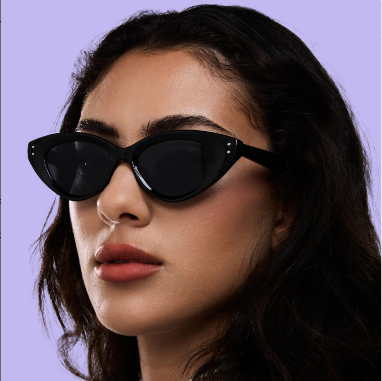
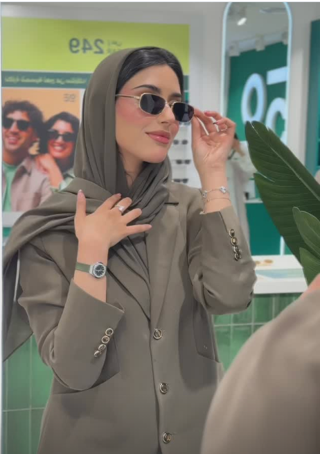
People-first: Families, young shoppers, and diverse customer groups
Everyday moments: Frames worn in social, work, and leisure settings
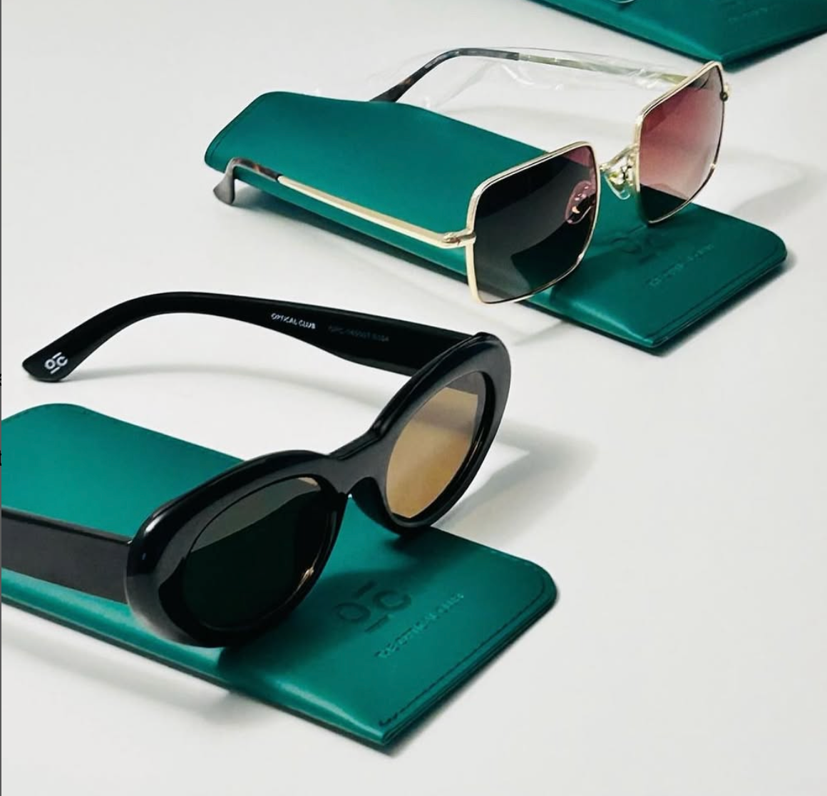
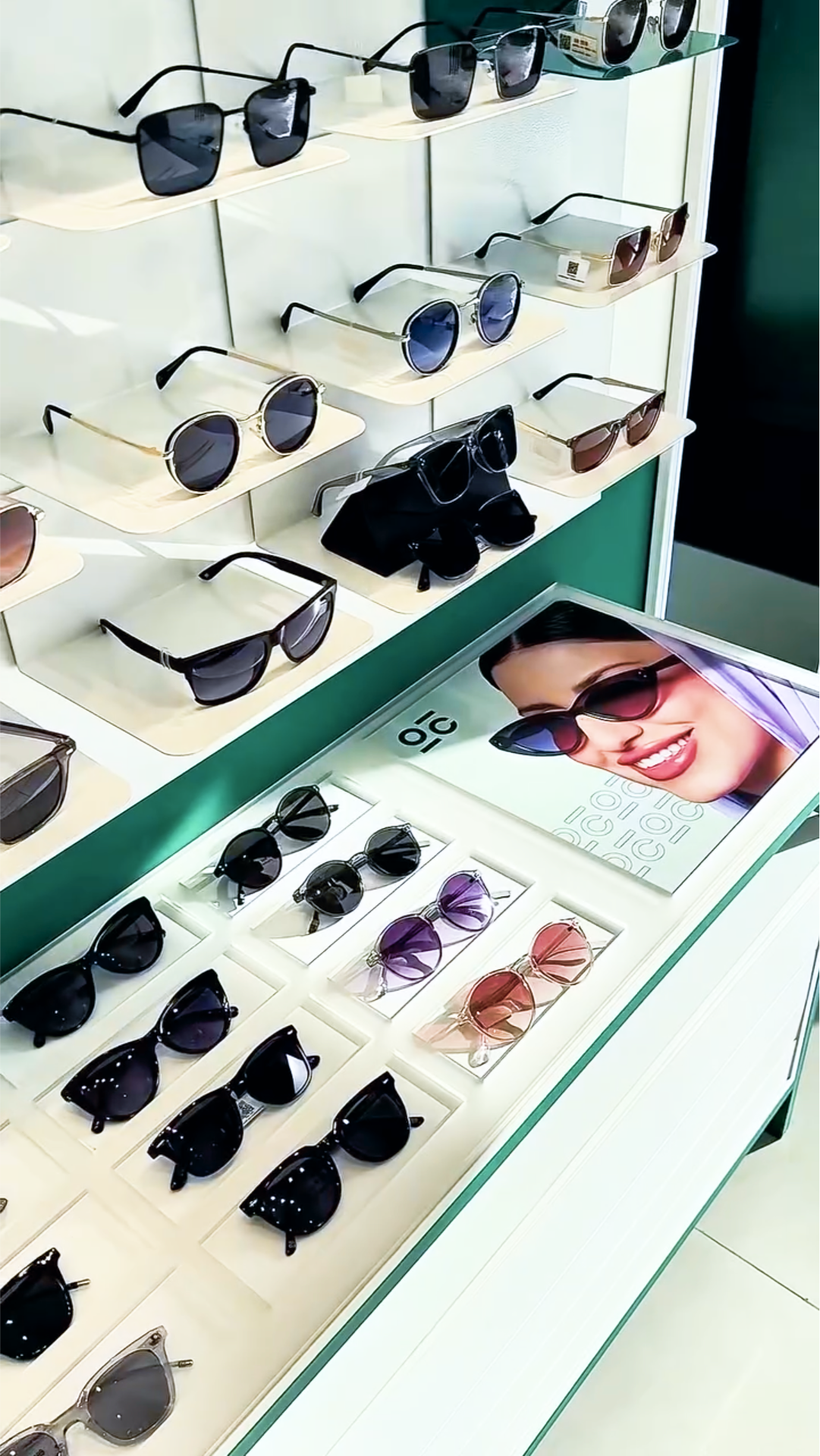
Style + functionality: Clean product photography with lifestyle context




Photography credits - Optical Club Team, KSA
